Overview
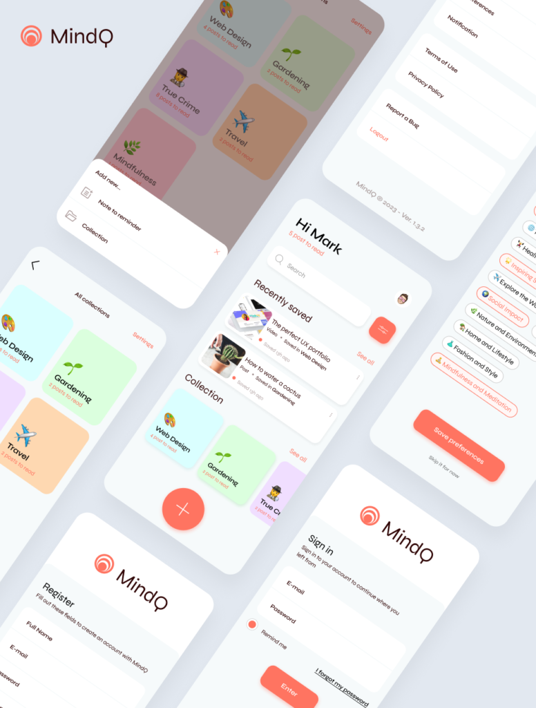
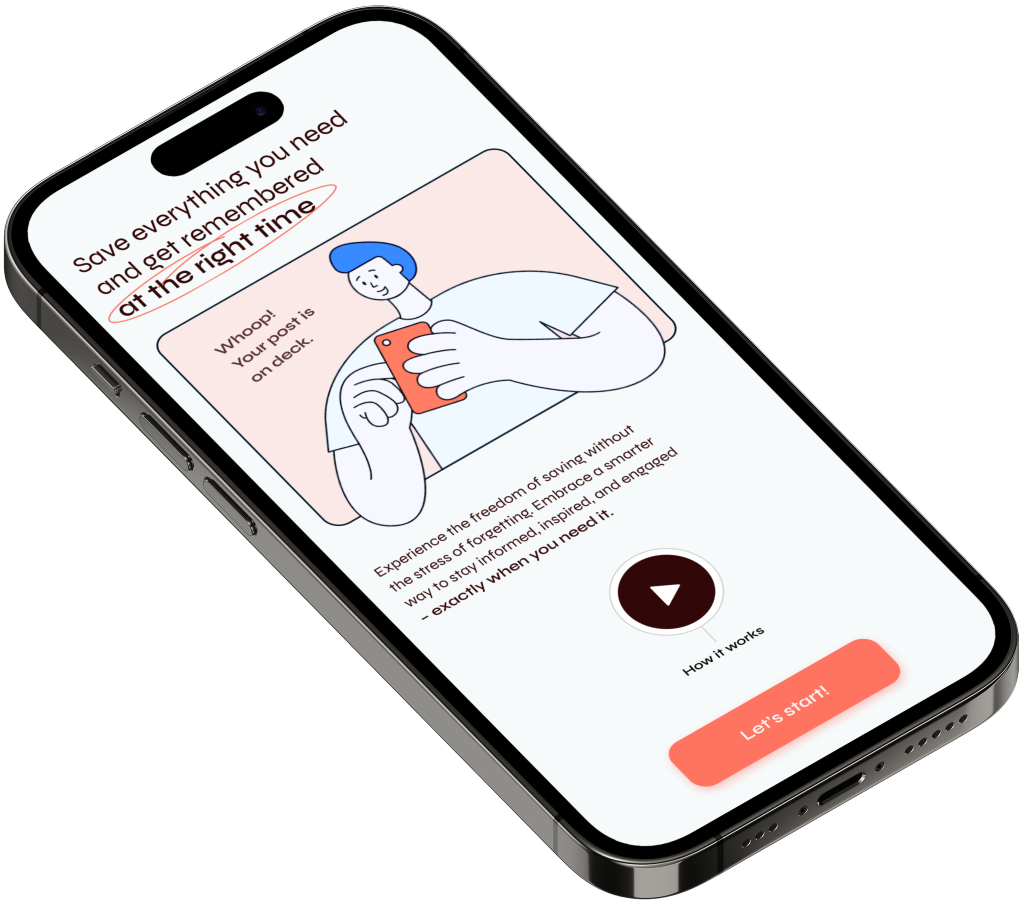
Many users frequently come across compelling content online but often struggle to remember or engage with it later. To address this issue, we offer an organized and personalized platform that allows users to easily access and revisit their saved content from the web. This solution encourages productivity and helps users focus on the content that inspires and elevates them, effectively bridging the gap between discovery and engagement.
To date, numerous apps allow users to save web content they come across, and often, these “Saved Content” sections become virtual graveyards of posts we’ll never revisit because we get distracted by other things. Our minds are proactive in wanting to save content because it gives us hope that we’ll delve into a specific topic or learn something new. However, users tend to forget about these saved items due to external distractions.
The goal is to encourage the user to stay focused and not miss out on anything they consider important by saving it in specific collections, and then revisiting the content at the most convenient time of day.
Hypotesis
The hypothesis has primarily been substantiated through data analysis conducted on user research, which predominantly encompassed the user survey and in-depth interviews.
- One-Click Saving
Users should be able to save web content with a single click or tap. This action should be intuitive and quick. - Content Preview
Before saving, users could be provided with a preview of the content, including a title, description, and possibly a thumbnail image, to help them identify it later. - Collections
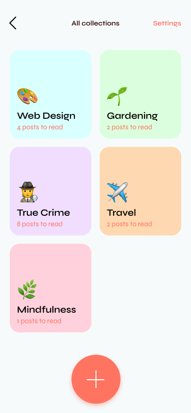
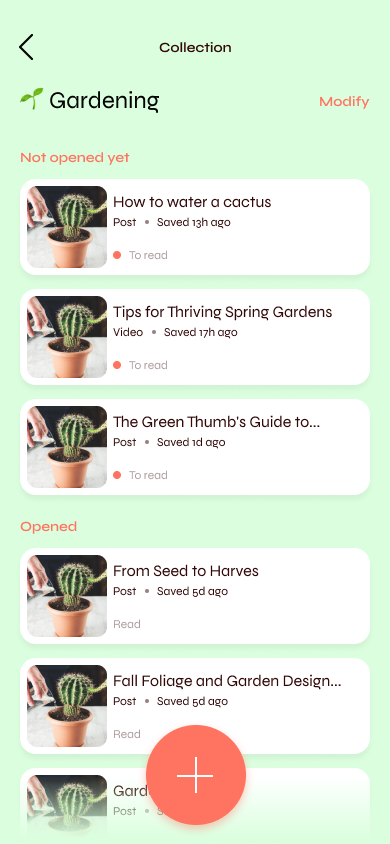
Users should have the option to create multiple collections to categorize their saved content. For examples, “Articles” “Videos” or specific topics of interest. - Offline Access
Provide the option to save content for offline access, ensuring that users can revisit it even without an internet connection. - Cross-Platform Sync
Ensure that saved content and collections are synchronized across all devices where the app is available. - Integration with Web Browsers
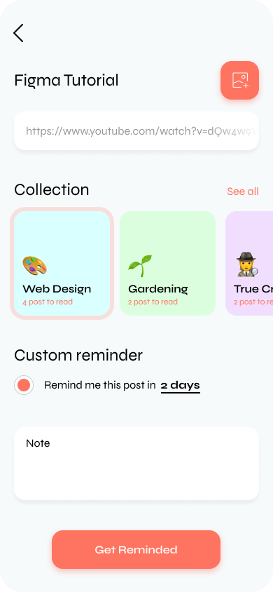
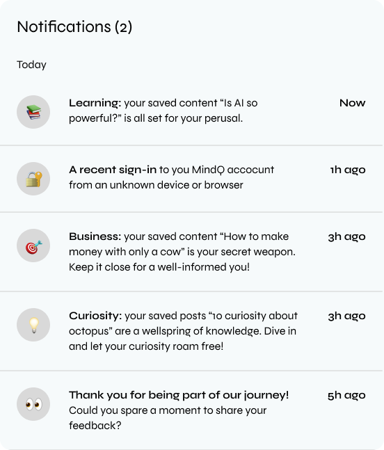
Offer browser extensions or plugins that make it convenient for users to save content directly from their web browsers into the application. - Notification Preferences
Allow users to set notification preferences for reminders to revisit their saved content. These reminders should be adaptable based on user habits. - Privacy Controls
Ensure that users have control over the privacy settings of their saved content, allowing them to choose whether to keep it private or share it with others. - Search Functionality
Implement a robust search feature that allows users to find saved content quickly using keywords, tags, or other criteria.
User Survey
A total of 30 respondents answered 9 questions, and the following responses are those which have influenced the product’s design. Here’s some of key questions:
Question #1: How regularly do you save online content for later reading or viewing?
- Multiple times a day: 46%
- Multiple times a week: 33%
- Multiple times a month: 20%
Question #2: What types of online content do you commonly save for later?
- Media content: 33%
- Articles or blog posts: 53%
- Bookmarks or URLs: 20%
Question #3: What factors influence your decision to revisit and consume saved content?
- Relevance or interest: 40%
- Organization and ease of access: 26%
- Social recommendations: 33%
Question #4: How do you prefer to receive reminders or notifications for saved content?
- I don’t want reminders or notifications: 34%
- Email reminders: 18%
- Push notifications on my device: 40%
Question #5: What are your feelings regarding a smart notification system based on user behavior and device usage?
- Favorable: 45%
- Neutral: 30%
- Concerned: 25%
User Persona
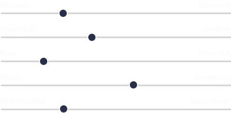
Based on a comprehensive analysis of survey results and interview responses, a user persona has been crafted to mirror the characteristics and preferences of the diverse MindQ user base.

Andrew Greene
“The best way to predict the future is to create it.”
INFORMATION
- AGE: 28
- JOB TITLE: Software Developer
- STATUS: Single
- LOCATION: Atlanta, GA
- BIO: Andrew is a tech enthusiast and a software developer with a passion for cutting-edge technologies. He loves exploring AI, machine learning, and emerging trends in the tech industry. Lucas is known for his innovative projects and often mentors aspiring developers.
GOALS
- To create groundbreaking software applications
- Stay at the forefront of tech trends
- Share his knowledge through teaching and mentoring
NEEDS
- Stay organized with coding references
- Access to the latest research in AI and ML
- Tools for project management
PAIN POINTS
- Managing multiple development projects simultaneously
- Staying updated on rapidly evolving technologies
- Finding the right resources efficiently.
PERSONALITY
Information architecture
The Information Architecture represents the MVP that primarily prioritizes essential features, with a strong emphasis on touchpoint and a streamlined, fast, and user-friendly online top-up process.

Colors and Styles
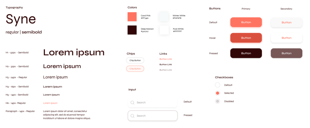
I have carefully selected a color palette that incorporates a combination of warm and cool tones to represent the balance aspect. This color scheme aims to evoke a sense of harmony, creating a visually engaging experience for users.
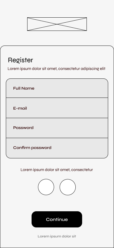
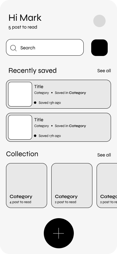
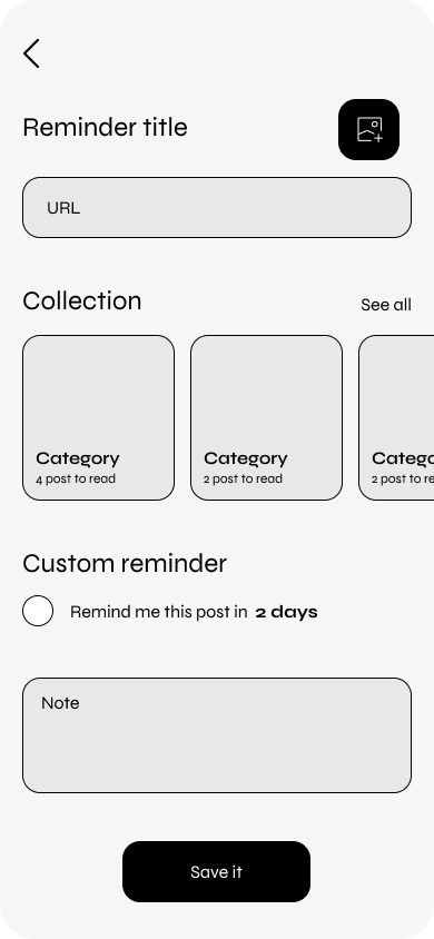
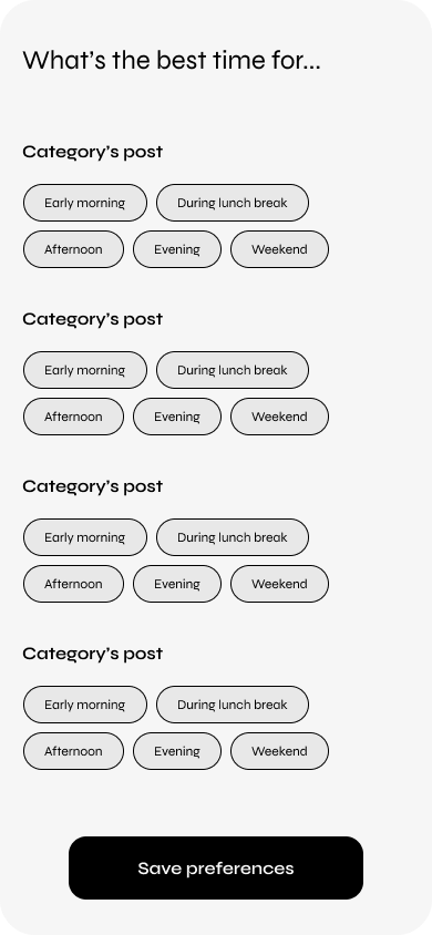
Mid-fi design
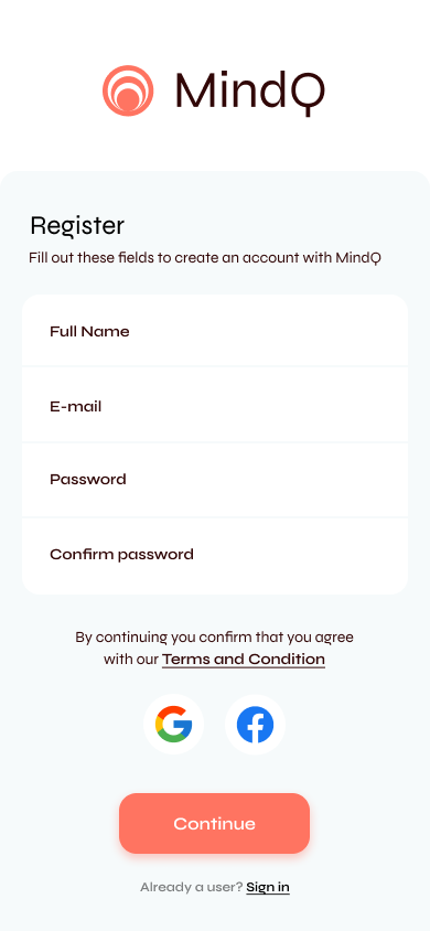
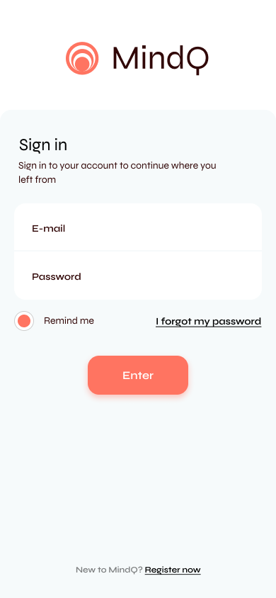
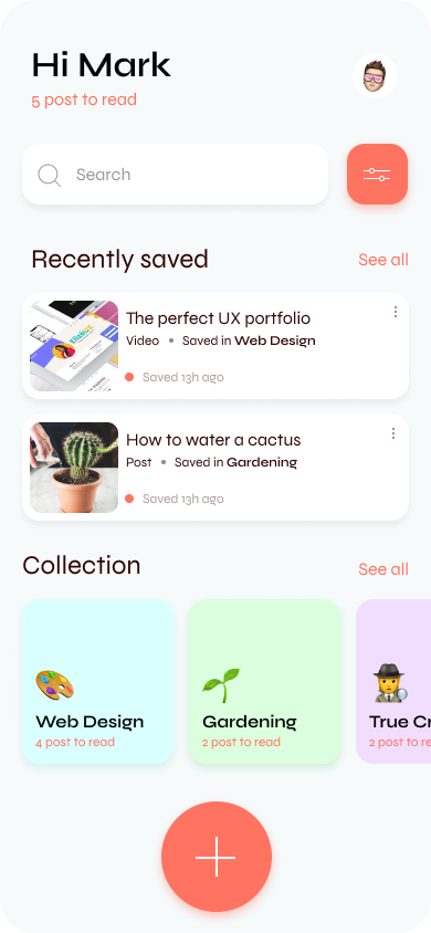
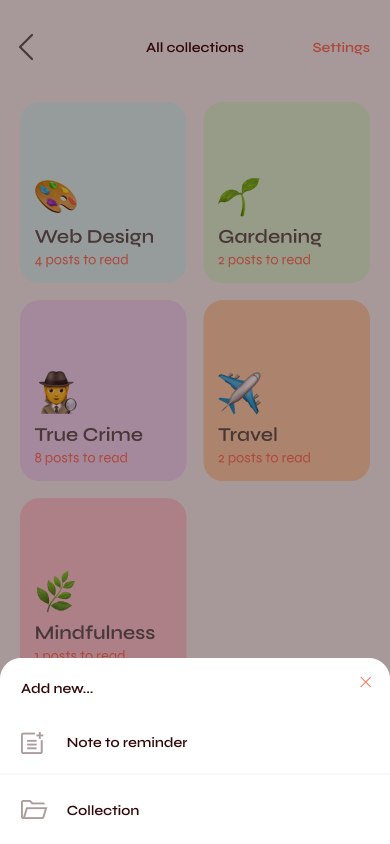
Hi-fi design
