Overview
Freshly, an emerging Italian online supermarket, recently entered the market with a mission to provide fresh, high-quality food. Their goal is to establish themselves as the most innovative and trendsetting digital platform in the industry.
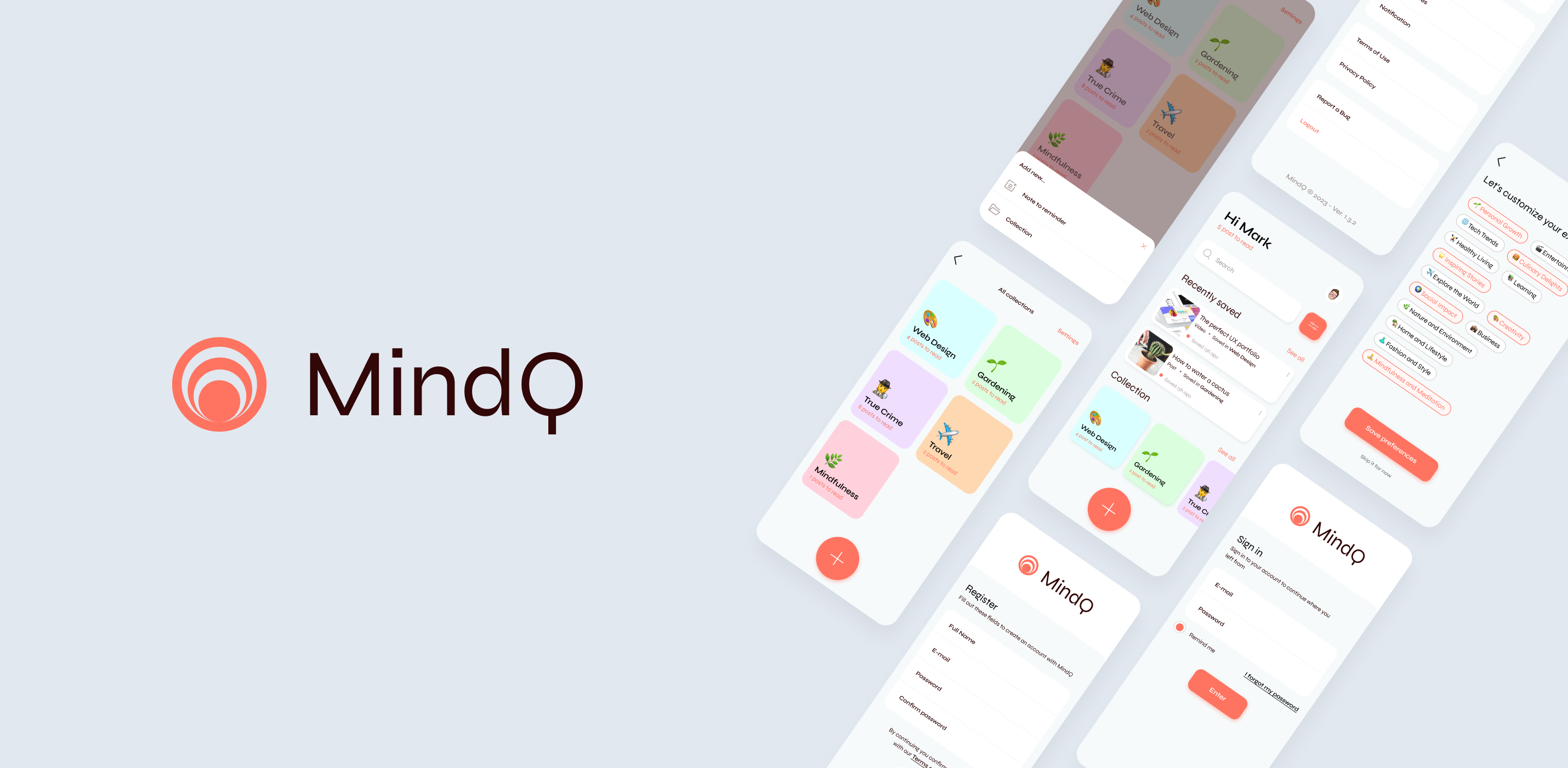
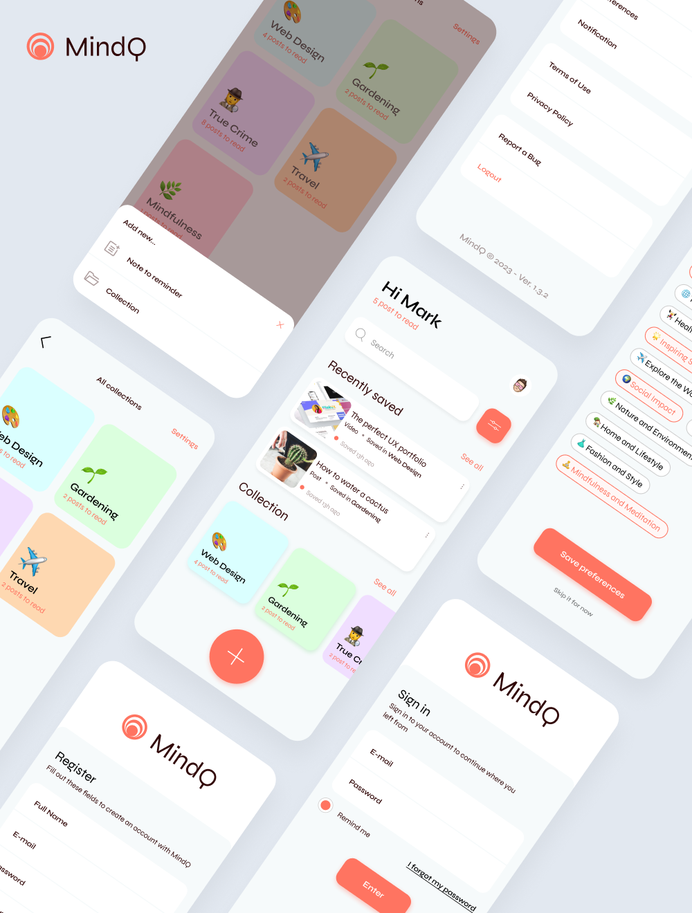
As the UI Designer, my task was to develop the concept for a hybrid mobile application. To meet the business objectives—creating an app with a distinctive look and feel, alongside an exceptional user experience that differentiates the brand from its competitors—I began by conducting a thorough benchmark analysis of direct competitors in the Italian market.
The client provided me with some UX screens developed by another collaborator, but I was given the creative freedom to implement new sections and areas aimed at enhancing the user experience within the app.
Objectives
- Design an innovative e-commerce platform with a recognizable look & feel and a strong user experience to help the brand stand out from its competitors.
- Enhance the existing UX by introducing new sections and functionalities.
- Optimize the user journey to facilitate product navigation and support informed decision-making.
- Design clear and intuitive product cards to improve the shopping experience.
Strategic Value
By conducting a comprehensive benchmark analysis of direct competitors in the Italian market, I identified critical design elements that contribute to a successful online grocery platform. This research informed the creation of a unique user interface, incorporating new sections and functionalities to enhance the existing user experience.
The strategic objectives included designing an innovative e-commerce platform with a recognizable look and feel, optimizing the user journey for seamless product navigation, and crafting clear, intuitive product cards. By focusing on these objectives, I aimed to ensure that Freshly establishes itself as the leading trendsetter in the digital supermarket arena, fostering customer loyalty and engagement.
The Challenge
The existing brand guidelines for Freshly lacked a modern and visually appealing aesthetic, primarily due to the overwhelming use of a dominant red color. This choice risks compromising the overall user experience, particularly in the context of an online grocery app where clarity and accessibility are paramount.
Recognizing the opportunity for improvement, the client empowered me with the creative freedom to explore and develop additional wireframes and sections. This flexibility allowed me to focus on elevating the user experience, ensuring that the app not only reflects Freshly’s commitment to quality but also resonates with the target audience in a visually engaging and functional manner.
Research
To achieve the goal of standing out among competitors, I identified three main direct competitors in the Italian market. I analyzed several key design factors such as usability, accessibility, aesthetics, and innovation.
Here’s what emerged from the analysis:
| Competitor #1 | Competitor #2 | Competitor #3 | |
|---|---|---|---|
| Usability | 5 | 7 | 8.5 |
| Consistency | 6.5 | 7.5 | 8 |
| Aesthetics | 6 | 7 | 7.5 |
| I.A. | 6.5 | 7.5 | 8 |
| Interactions | 6 | 6.5 | 8.5 |
| Accessibility | 5 | 6.5 | 7.5 |
| Innovation | 6 | 7.5 | 8 |
| Overall Design | 6 | 7 | 8.5 |
Competitor #1
It is an Italian online grocery shopping service that delivers from users’ preferred supermarkets, even on the same day. However, the design of the application is not very user-friendly and is overloaded with textual information. It lacks significant innovations and smooth navigation.
Competitor #2
It is the leading online retailer for fresh food in Italy, providing its customers with top-notch service and high-quality products from excellent producers. The application’s design is commendable, effectively showcasing fresh food with legible fonts and a strong visual hierarchy. I found some innovative elements in the immersive introduction.
Competitor #3
It is an app that delivers groceries in just a few minutes. The app’s design is impressive: it is user-friendly, innovative, and emphasizes visual information and micro-interactions. The images are of the highest quality, making the user experience exceptionally engaging.
It boasts high usability, ensuring a smooth and intuitive user journey.
UI Elements
Initially, I considered developing the concept using red and its more vibrant shades. However, this approach led to a less accessible platform that conveyed a sense of urgency and emergency. Consequently, I explored a color palette that could better align with the brand’s identity. I quickly ruled out the use of green, as it would make the platform less distinguishable from competitors.
The client provided me with the freedom to introduce new visual elements to ensure the app stands out in the competitive landscape, especially given the absence of clear brand guidelines.
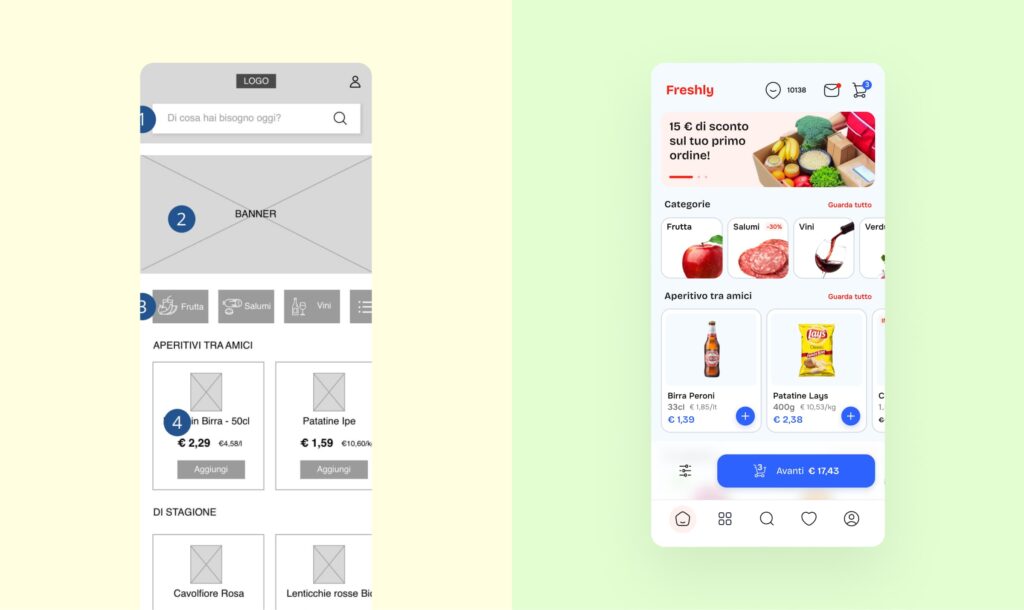
After this research phase, I began designing the app’s UI, integrating new elements and functions into the wireframe.
Design rationale
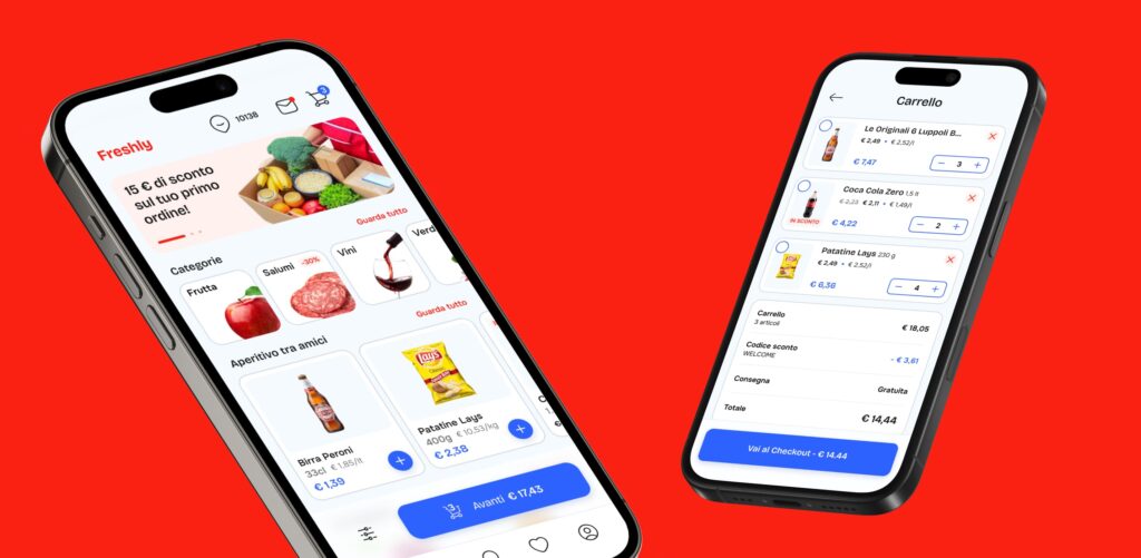
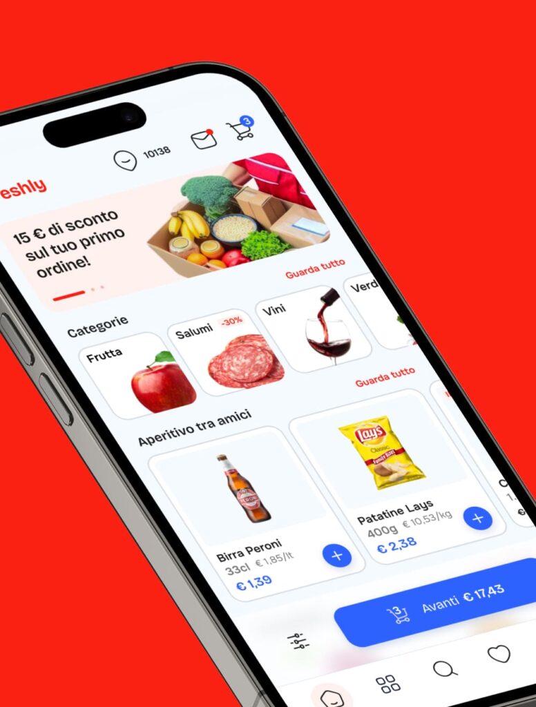
Home
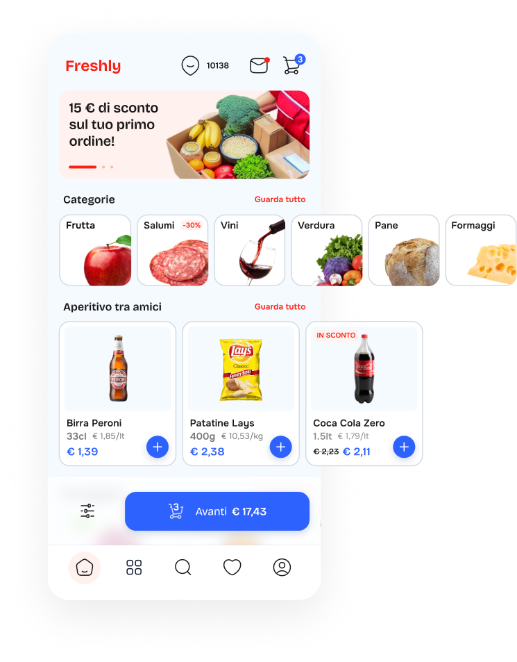
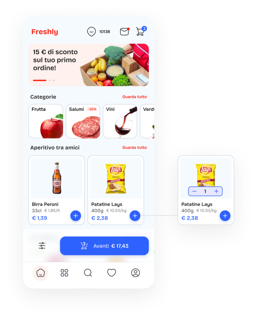
- Address Icon in Top bar for Location-Based Product Availability
- Choice: The inclusion of an address icon in the navbar allows users to check product availability based on their location.
- Rationale: This feature addresses the dynamic needs of our users, especially young professionals who may be shopping from different locations. It sets our app apart by offering personalized and location-specific product availability information.

- Color Scheme with Blue as Primary Color
- Choice: I chose blue as the primary color instead of red, the color of our brand.
- Rationale: Blue signifies trust and reliability, aligning well with the grocery shopping experience. Red, with its associations of urgency, may not match the app’s calm and practical nature. Vibrant blue, suitable for our youthful audience, maintains a sense of reliability.
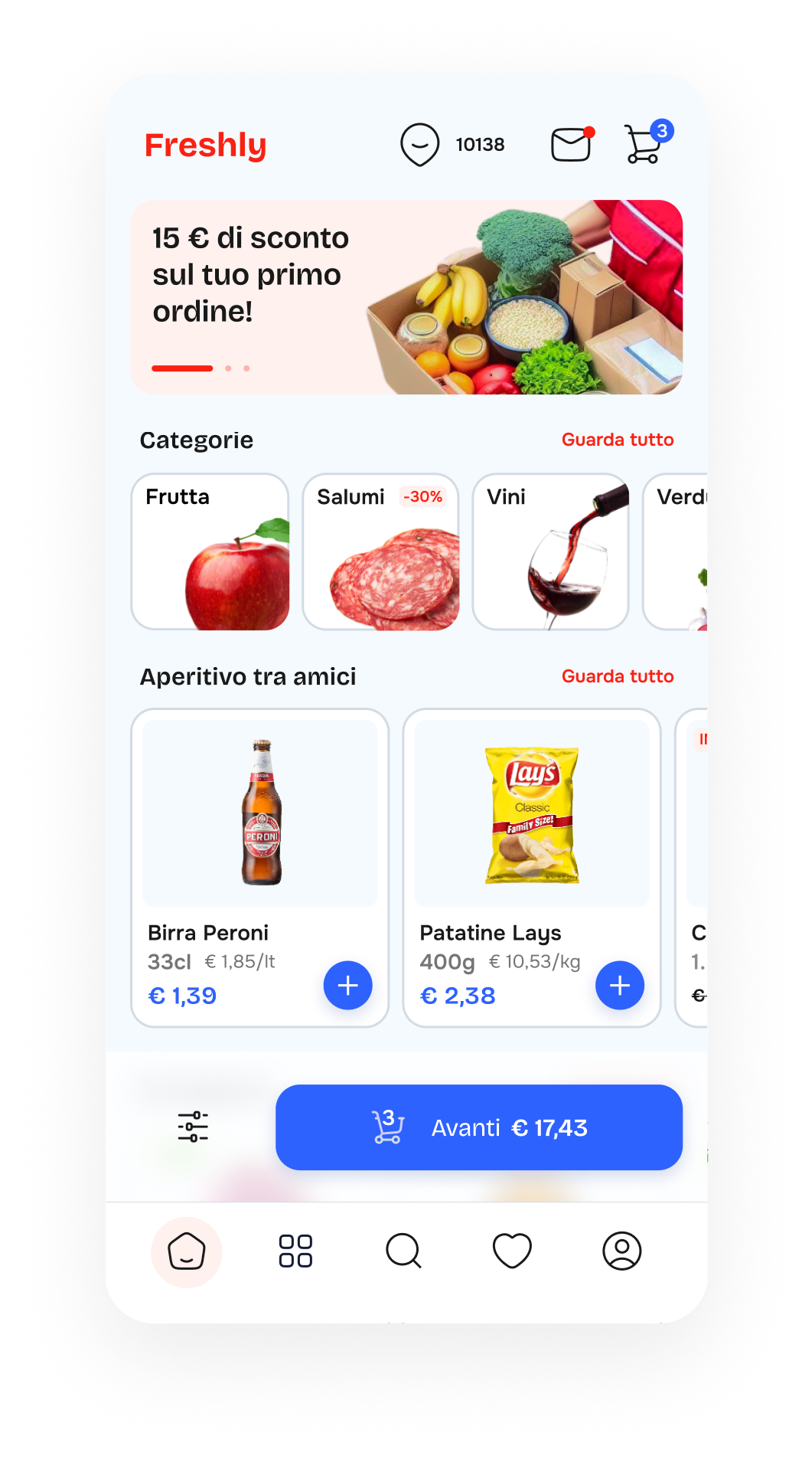
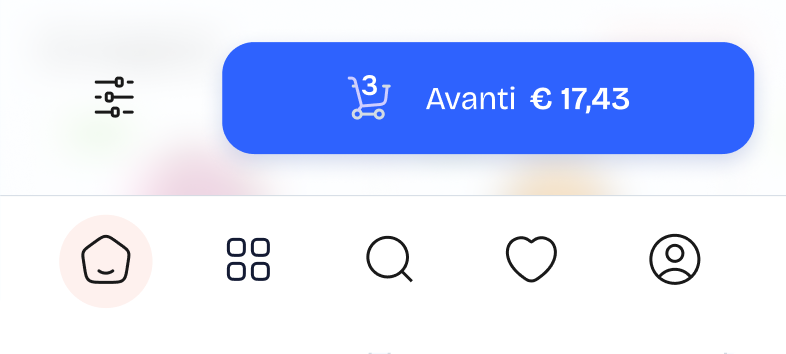
- Implementation of a Bottom Bar
- Choice: I introduced a bottom bar navigation with key sections
- Rationale: Placing crucial navigation options in the bottom bar ensures easy, one-handed access on mobile devices. “Home” offers quick access to the main screen, “Favorites” caters to frequently purchased items, enhancing the user experience for our on-the-go audience. Placing the search option in the bottom bar ensures quick access without needing users to return to the home screen.
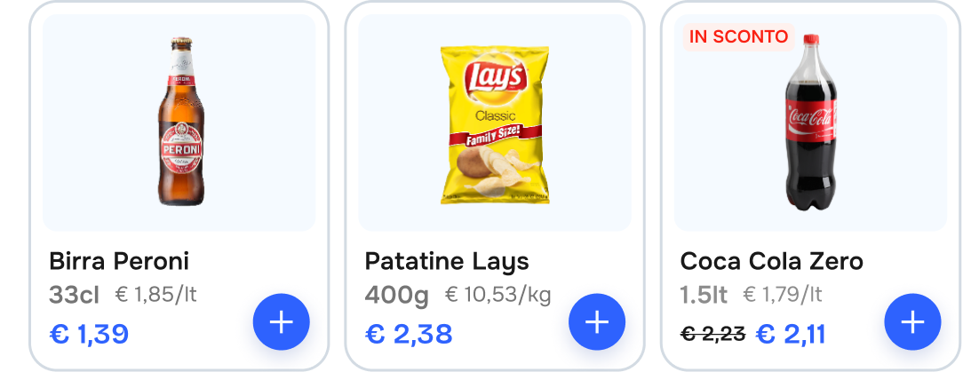
- Simplified Card Layout with Clear Titles
- Choice: I’ve adopted a straightforward approach by using simple titles and breaking down information in the product card layout.
- Rationale: Clear and concise titles combined with well-organized information on product cards make it easy for users to quickly grasp key details.
Product page
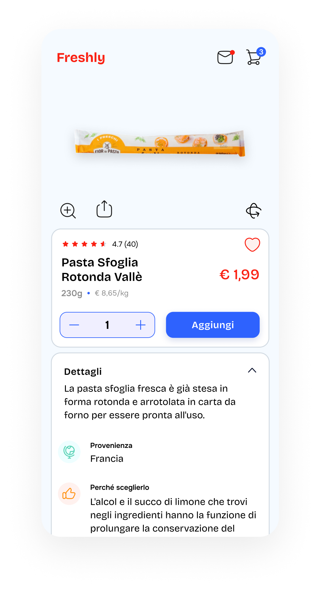
- Icon for product in-depth
- Choice: I’ve introduced “3D Navigation,” “Zoom,” and “Share” icons on the product page.
- Rationale: These additions elevate the user experience by providing valuable functionalities. The “3D Navigation” icon allows users to explore products from all angles, enhancing their understanding. “Zoom” offers a closer look at product details, aiding in decision-making. “Share” enables users to easily recommend or share products, fostering engagement and user-generated content.

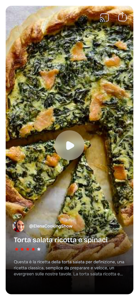
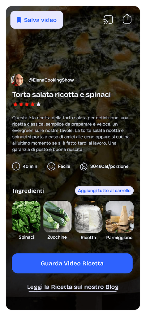
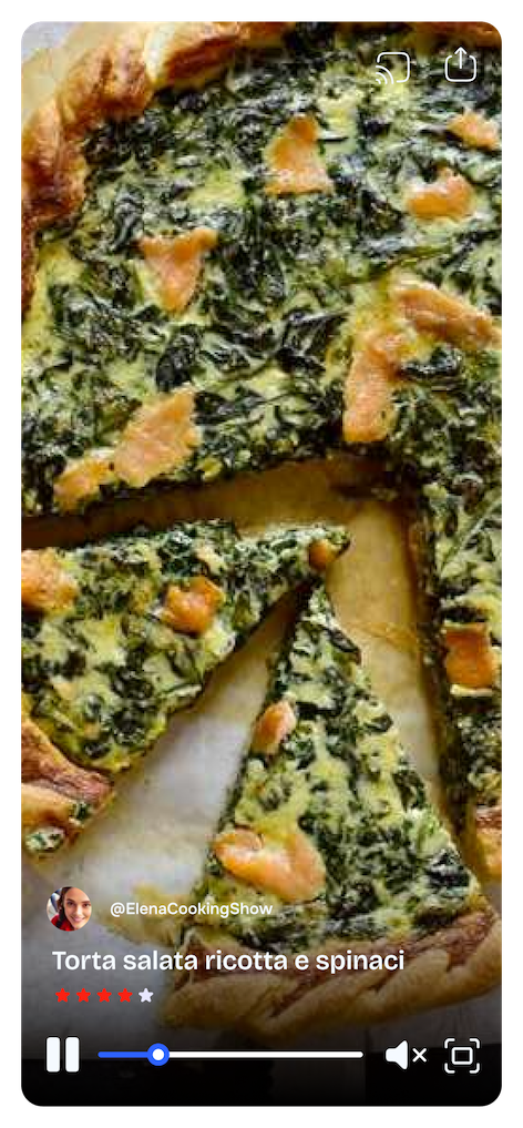
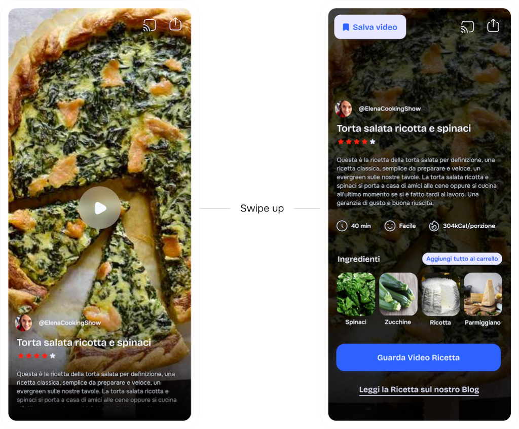
- Innovative Recipe Videos with Full Blog Access
- Choice: I’ve introduced recipe videos with the option to access the full recipe on Freshly’s blog.
- Rationale: This innovative feature enhances user engagement and provides value beyond grocery shopping. Users can explore and enjoy culinary experiences, reinforcing our app’s distinctiveness and making it more than just a grocery app.
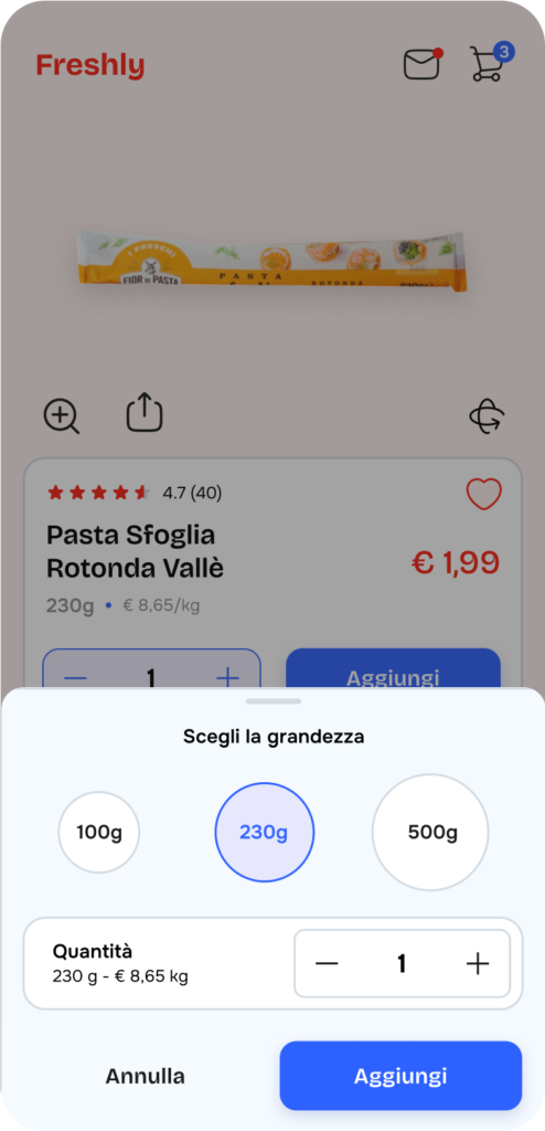
Add product
It became evident that integrating the “Add Product” section to the product page might overwhelm the information section with excessive content. To maintain a clean and user-friendly interface, I decided to adhere to the wireframe layout. Instead, I have introduced visual indicators for various measurements to assist users in making informed decisions, ensuring a visually uncluttered and efficient shopping experience.
Cart product
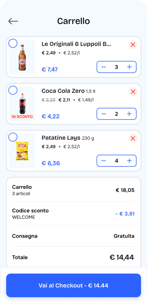
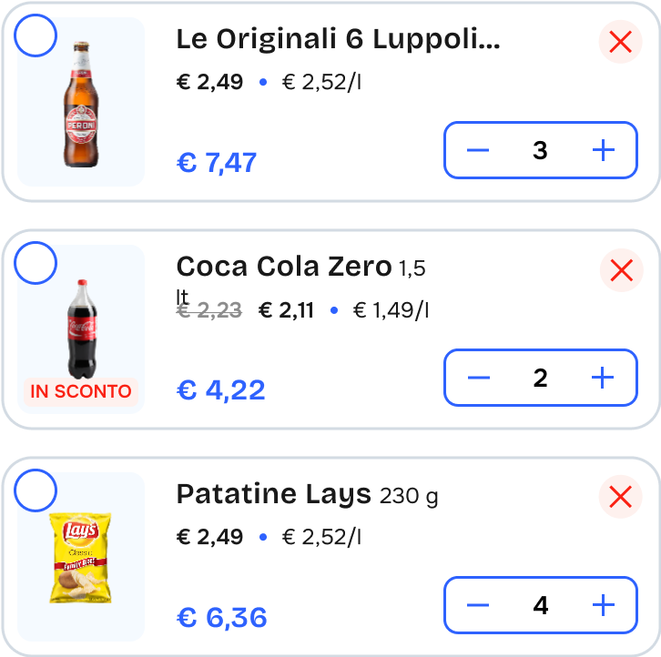
- Cart Section with Intuitive Quantity Adjustments
- Choice: I’ve provided users with the ability to easily add or remove quantities of products directly within the product card, eliminating the less intuitive swipe gesture.
- Rationale: Enhancing the user experience is a priority in our quest to create the best ecommerce app. Making quantity adjustments intuitive saves time and frustration, contributing to a seamless shopping experience.
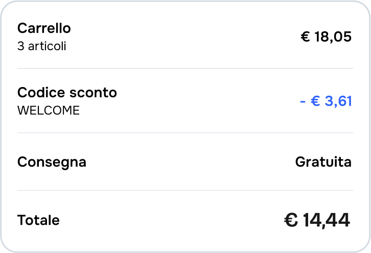
- Pre-Checkout Price Recap in Cart Section
- Choice: I’ve included a brief summary of the shopping cart, displaying the final price before entering the checkout process.
- Rationale: This feature adds transparency and convenience, helping users make informed decisions and reducing any surprises during the checkout process. It reinforces our commitment to an exceptional user experience.
- Streamlined Checkout Experience by Removing Navbar
- Choice: I’ve provided users with the ability to easily add or remove quantities of products directly within the product card, eliminating the less intuitive swipe gesture. [schermata swipe gesture]
- Rationale: Enhancing the user experience is a priority in our quest to create the best ecommerce app. Making quantity adjustments intuitive saves time and frustration, contributing to a seamless shopping experience.
Other section
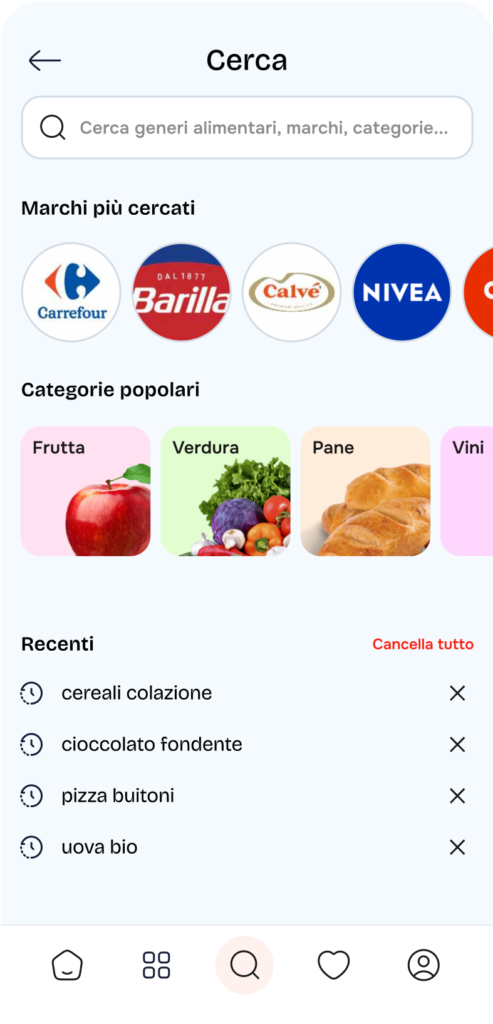
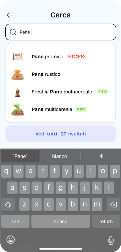
- Search Bar
- Choice: The search bar has been enhanced to include the most searched brands, popular categories, and recent searches, along with text autocomplete suggestions when searching for a product.
- Rationale: These enhancements aim to improve the overall search experience for users, making it faster and more intuitive to find desired products. By showcasing trending brands and categories, users can quickly access popular items, while the autocomplete feature reduces the effort needed to type full product names, enhancing efficiency. This approach not only streamlines the user journey but also helps guide users toward discovering new products they may not have initially considered.
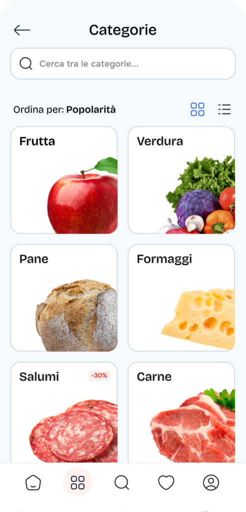
- Categories
- Choice: Users now have the option to select their preferred view for categories (Grid or Row) and high-quality images have been implemented for each category.
- Rationale: Offering users the flexibility to choose between different viewing formats caters to individual preferences and enhances usability. A grid view allows for a visually appealing layout, showcasing multiple items at once, while a row view provides a more straightforward, linear presentation. High-quality images further enrich the browsing experience, capturing user attention and encouraging exploration. This combination fosters greater engagement and satisfaction as users navigate through various categories.
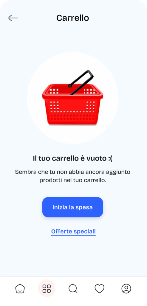
- Empty cart
- Choice: An inviting button has been added to the empty cart section, encouraging users to start shopping and discover special offers.
- Rationale: This feature serves to motivate users who may feel disheartened by an empty cart, transforming a potentially negative experience into a positive invitation to engage with the app. By highlighting special offers, the button not only encourages immediate action but also reinforces a sense of value and excitement around the shopping experience. This proactive approach is designed to enhance user retention and stimulate purchasing behavior.
Micro interaction
Product Card Quantity Counter
- Choice: When users click the “+” button to add a product to the cart, an overlay counter appears to indicate the quantity to be added.
- Rationale: This feature enhances the user experience by providing immediate feedback on the quantity being added to the cart. It eliminates ambiguity, allowing users to quickly adjust the amount before finalizing their choice. By visualizing the quantity in real-time, users can make more informed decisions and reduce the likelihood of errors in their selections.
Interactive Recipe Video with Swipe-Up Feature
- Choice: In the video recipe section, users can press play to watch the food creator or swipe up to access a text version that includes timing, difficulty, calories, and ingredients, along with a CTA to add ingredients directly to the cart. At the bottom of this screen, there’s a CTA to replay the video or a link to continue reading the recipe on the blog.
- Rationale: This interactive feature caters to diverse user preferences, allowing them to choose between watching a video or reading a detailed recipe. By providing both formats, users can engage with the content in a way that best suits their learning style. The inclusion of a direct CTA to add ingredients to the cart simplifies the shopping experience, facilitating seamless transitions from recipe exploration to purchasing. Additionally, the option to replay the video or continue reading fosters deeper engagement with the content.
Prototype
Request the prototype of this app at hello@alessiomarcone.it