Overview
Enjoy is the leading car sharing service in Italy, with years of experience in the urban mobility sector. The service offers a wide fleet of vehicles, including cars, cargo vans, and electric vehicles.
Enjoy facilitates quick, sustainable, and stress-free transportation for citizens, supporting both regular users and newcomers to the world of shared mobility.
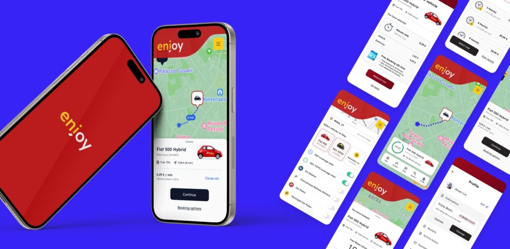
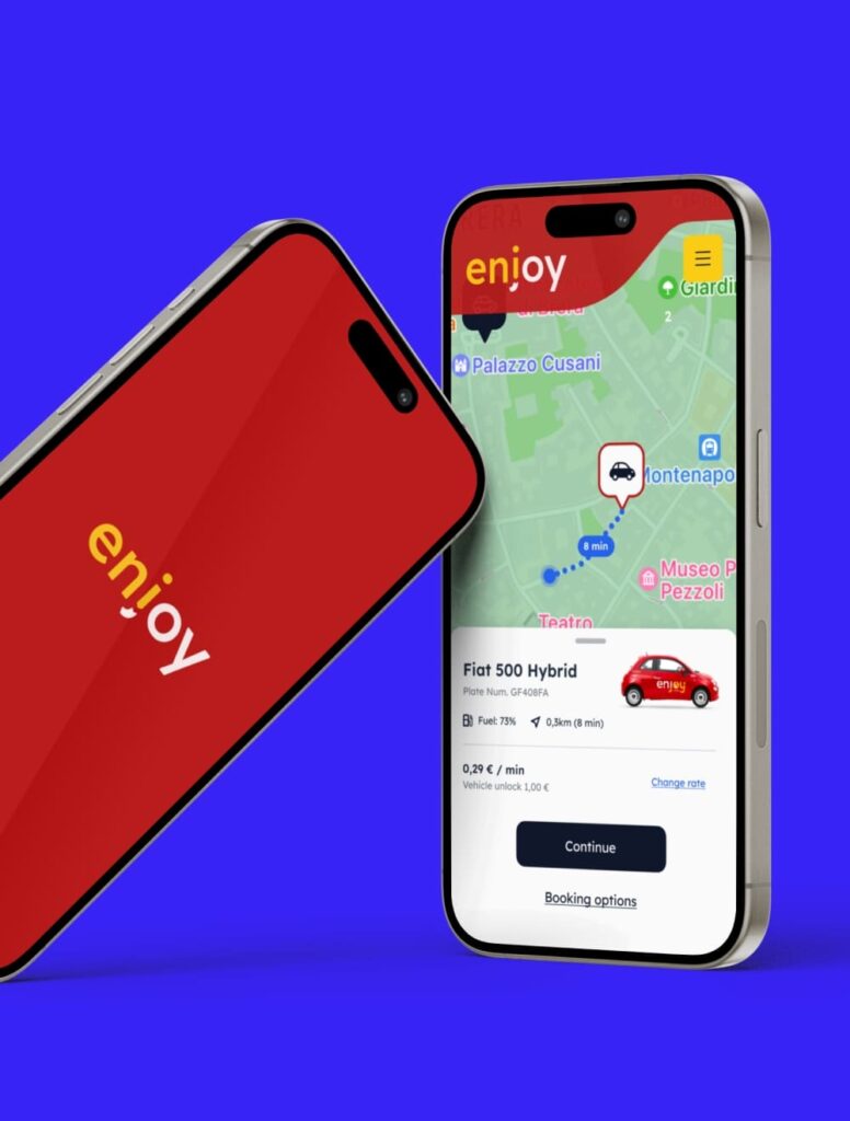
Recognizing the need for a more intuitive and accessible experience, I decided to propose a redesign concept for the platform. The main focus was to improve the interface for quick vehicle access and optimize the car rental process, offering users a seamless experience and clearer booking information.
Objectives
- Identify user pain points and usability issues that affect the efficient search for cars and access to information.
- Design a filtering feature that allows users to quickly and easily find the desired cars.
- Optimize the user journey to facilitate navigation between vehicles and support informed decision-making.
- Enhance the interface to provide an engaging and intuitive browsing experience, ensuring smooth navigation and easy access to information.
Strategic Value
I identified usability issues in the car filtering and navigation experience. To address these, I redesigned the main interfaces, simplifying the search process and providing users with tools to make informed decisions. This improved user satisfaction and helped keep the platform competitive in the short-term car rental online market.
The Challenge
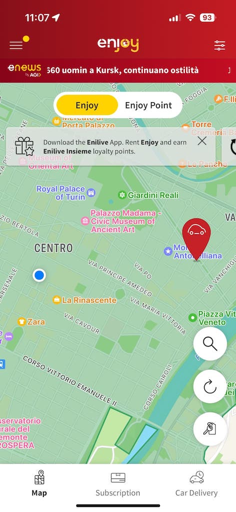
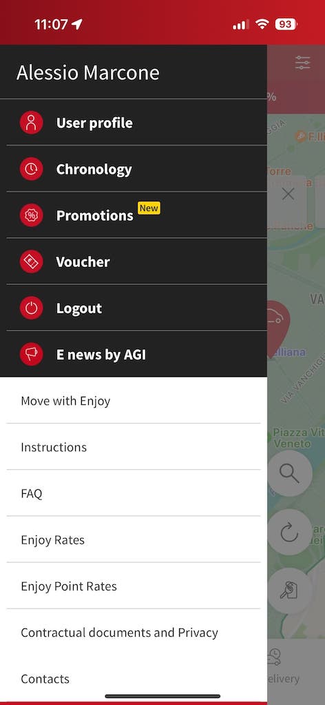
The UX and UI of the Enjoy app haven’t been updated in several years, raising concerns about its ability to effectively meet user needs.
The outdated interface, limited functionalities, and cluttered layout make it difficult for users to quickly and easily find the information they need.
Research
To fully understand user needs and identify areas for improvement, I began the redesign focusing on three key aspects:
- Identifying user pain points
- I conducted a heuristic evaluation to pinpoint existing issues and potential improvement areas.
- I conducted a heuristic evaluation to pinpoint existing issues and potential improvement areas.
- Understanding the typical user journey
- I interviewed 6 users (both current and potential users of Enjoy’s car-sharing service) to understand their experiences.
- I conducted usability tests to identify any issues and validate the findings related to the booking and vehicle selection pages.
These research activities allowed me to identify usability issues that affected the vehicle search and booking experience.
Based on these findings, I designed solutions that simplify the user journey and enable users to make informed decisions.
Insights & Recommendation
Insight 1: Complex and confusing navigation
The main menu includes secondary options that do not align with the actual needs of users, making it difficult to find necessary information. Additionally, some sections are hidden within a full-screen menu, further complicating access. The introduction of both the side menu icon and the filter icon in the header creates confusion, leading to uncertainty for the user.
- 70% of users reported difficulty in finding rental information.
- The average rating for interface clarity was 2 out of 5.
- 60% of users noted that essential menu options were hidden.
Recommendation 1
Optimize and simplify the main menu by introducing more relevant options for a more user-friendly navigation experience.
It is crucial to prioritize essential options like “Search” and “Profile.”
Additionally, it is recommended to place the filter icon near other navigation and booking icons to improve usability.

Outcome 1
Thanks to the changes made, users can now navigate the app more easily, quickly finding priority menu options, which has significantly improved the overall navigation experience.
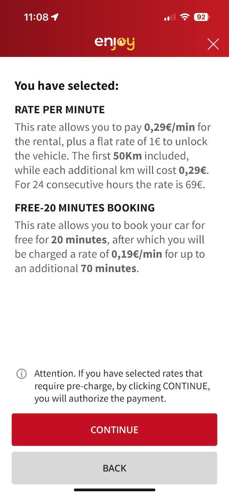
Insight 2: Cumbersome Booking Process
The current booking method is cumbersome, characterized by an overload of information that hinders immediacy.
- The average rating for ease of use was 2.5 out of 5.
- 80% of users reported feeling overwhelmed by the amount of text information during the booking process.
- 30% experienced difficulty completing the booking.
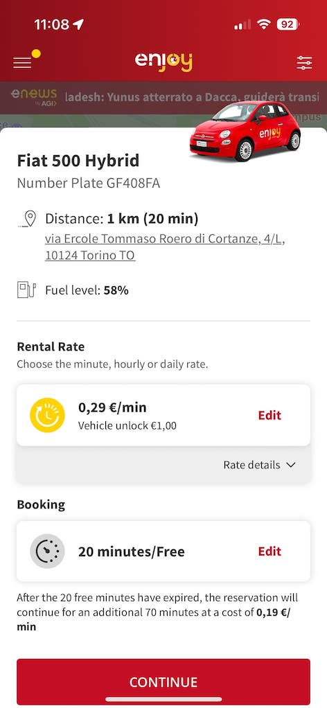
Recommendation 2
Simplify and improve the booking process by providing clear and transparent rental information. This would include reducing the number of steps required and optimizing the information presented at each stage.
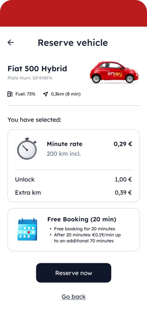
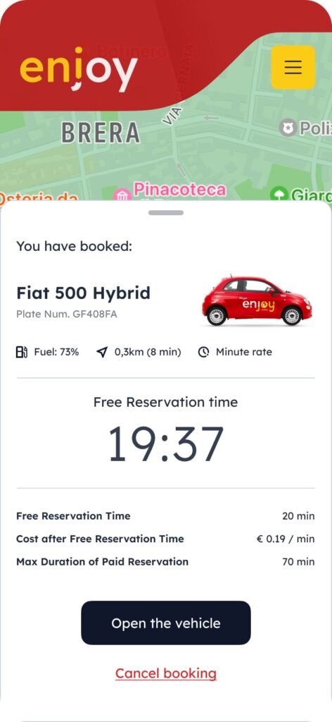
Outcome 2
Users now complete bookings more quickly and efficiently, with a significant reduction in assistance requests related to confusion during the process.
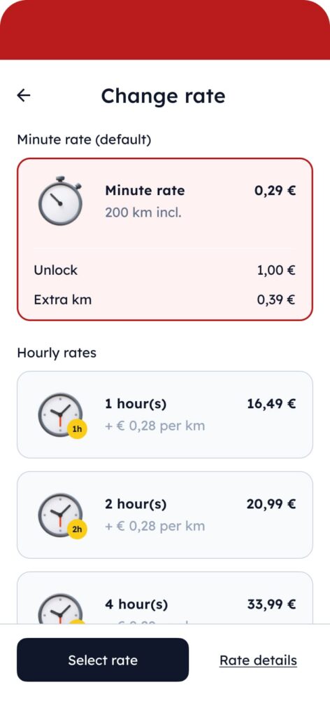
Insight 3: Unintuitive Filtering Menu
The current filtering menu is unintuitive and does not effectively present the available options to the user.
- 40% of users stated that they did not find the filtering menu clear or easy to use.
- The average rating for the usefulness of the filtering menu was 2 out of 5.
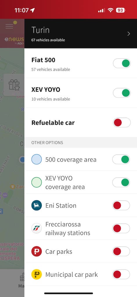
Recommendation 3
Redesign the filtering menu to allow users to view the filtered vehicle directly on the map. This should include a clearer layout and easily selectable options.
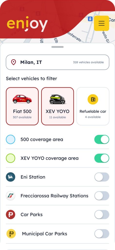
Outcome 3
The new filtering menu interface allows users to quickly locate vehicles of interest on the map, significantly improving search efficiency.
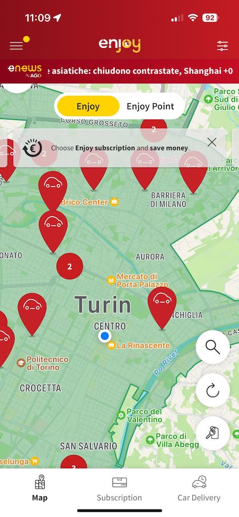
Insight 4: Intrusive Popups
The use of intrusive popups upon opening the app disrupts the user experience, making navigation less smooth and frustrating for users.
- 80% of users reported that the popups were annoying.
- The average distraction rating was 4 out of 5.
- 70% indicated that they would prefer an alternative placement for the popups.
Note: This phase recorded a higher frustration rate among users searching for a vehicle.
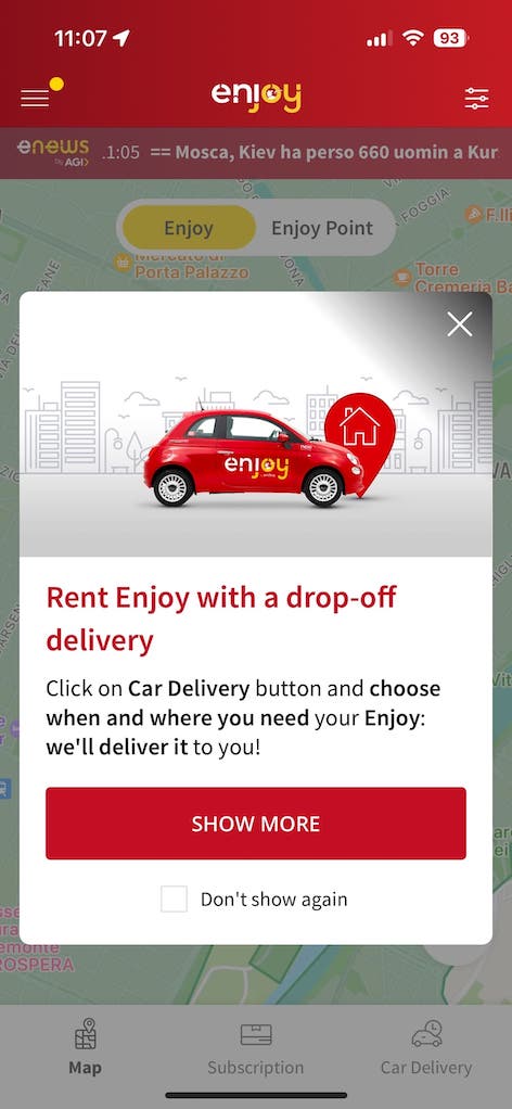
Recommendation 4
Change the location of the popups, moving them to the top of the map so they do not obstruct user navigation, allowing for more natural interaction with the app.
Outcome 4
This change reduced interruptions during app use, allowing users to better focus on navigation and overall user experience.
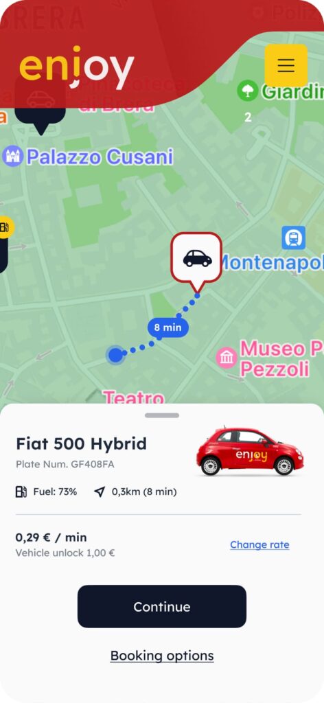
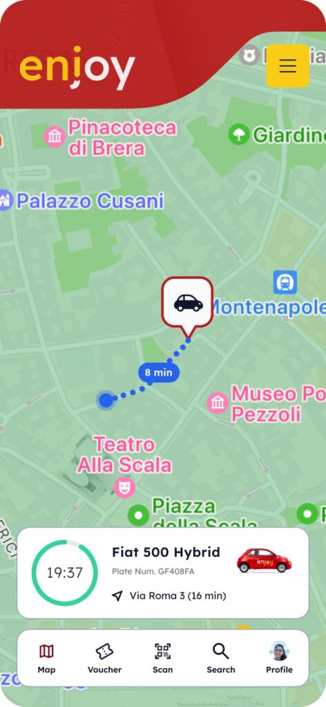
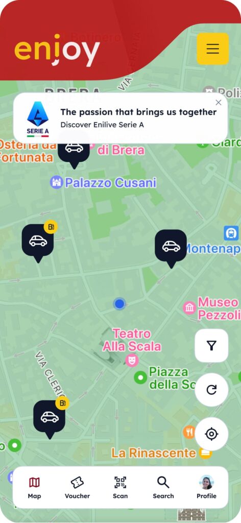
Insight 5: Distracting Markers
The red markers used for the cars can be distracting and compromise user navigation.
Recommendation 5
Replace the red markers with neutral colors to improve visual aesthetics and facilitate user navigation, making the interface more harmonious.
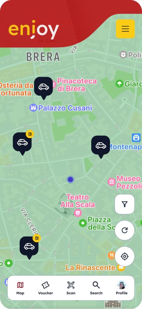
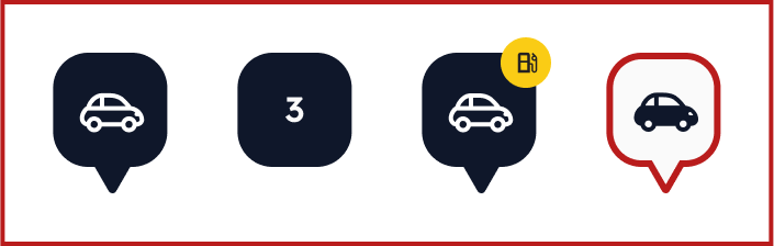
Outcome 5
The adoption of neutral-colored markers simplified navigation, allowing users to easily locate vehicles on the map without visual distractions.
Suggested features
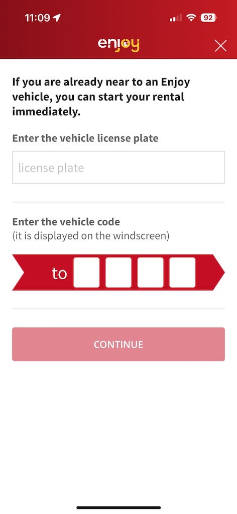
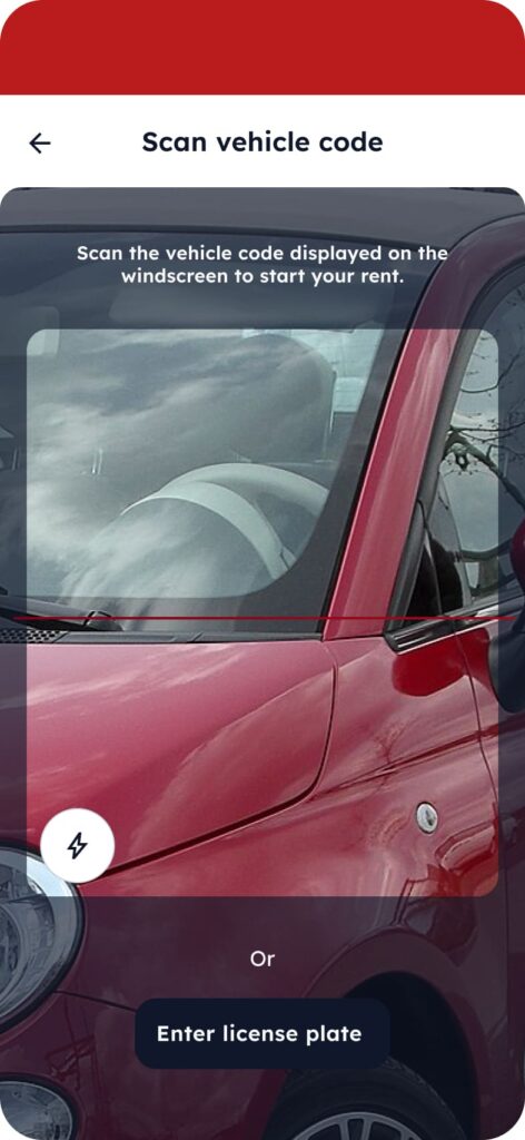
During the UX analysis, it became clear that users find unlocking nearby cars inconvenient. Currently, the system requires manually entering the license plate number, which can be challenging if the plate is hard to read. Alternatively, users can input a code from the car’s windscreen. To enhance this process, I proposed a new feature allowing users to scan the car’s code directly through the app, streamlining the unlocking process and improving the user experience by eliminating the need for manual input.
Next steps
- Optimizing the user registration process: The registration process will be redesigned to make it simpler and faster by reducing the number of required steps and improving the clarity of instructions. The aim is to lower user drop-off rates and provide a smoother experience when creating a profile, with options like simplified authentication through social logins or biometric access.
- Exploring optimal solutions for user support: New methods will be explored to ensure users receive help quickly and efficiently. This includes integrating intelligent chatbots and providing multiple support options, such as live chat, email, or call, directly from the app. The goal is to reduce response times and enhance problem resolution.

